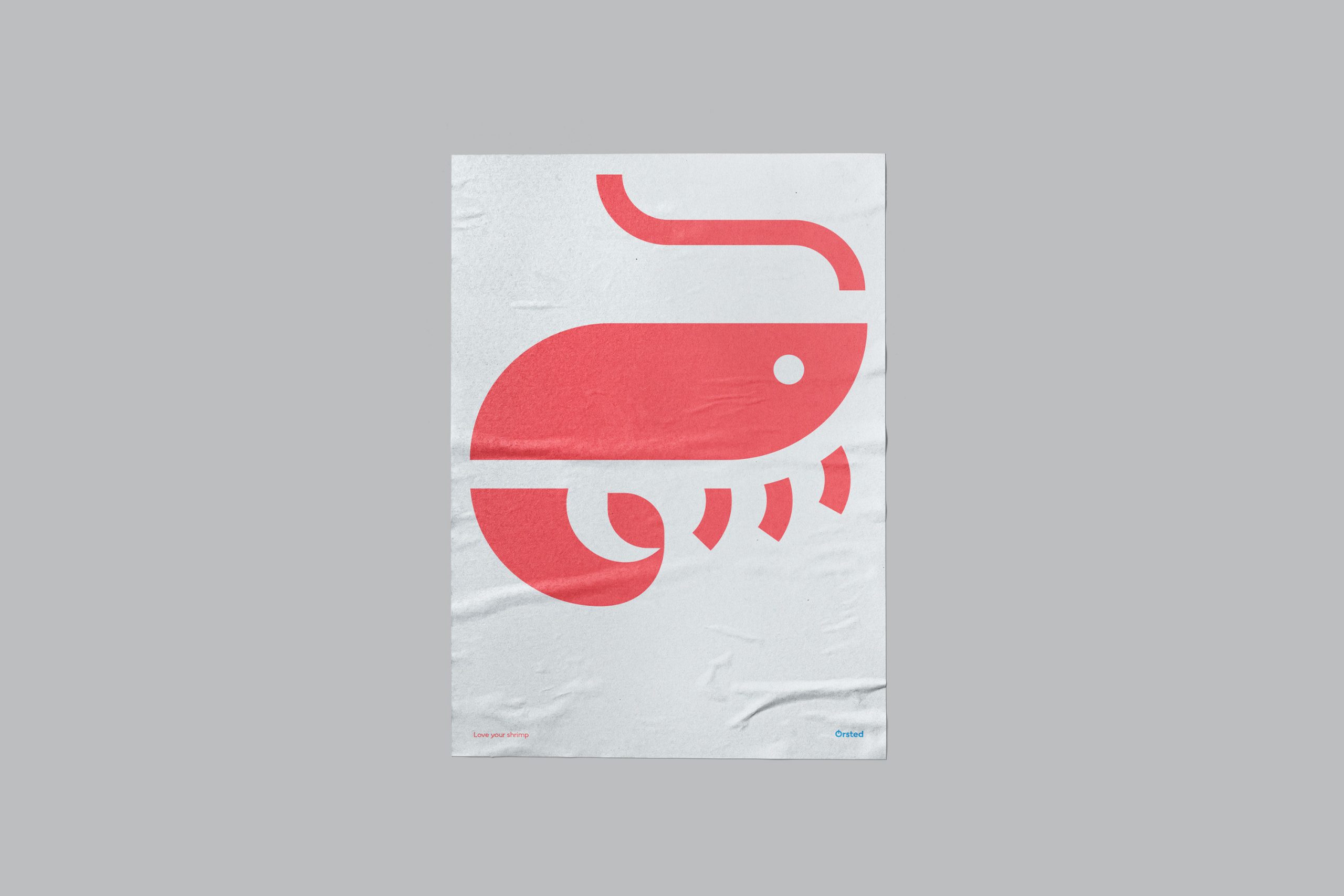
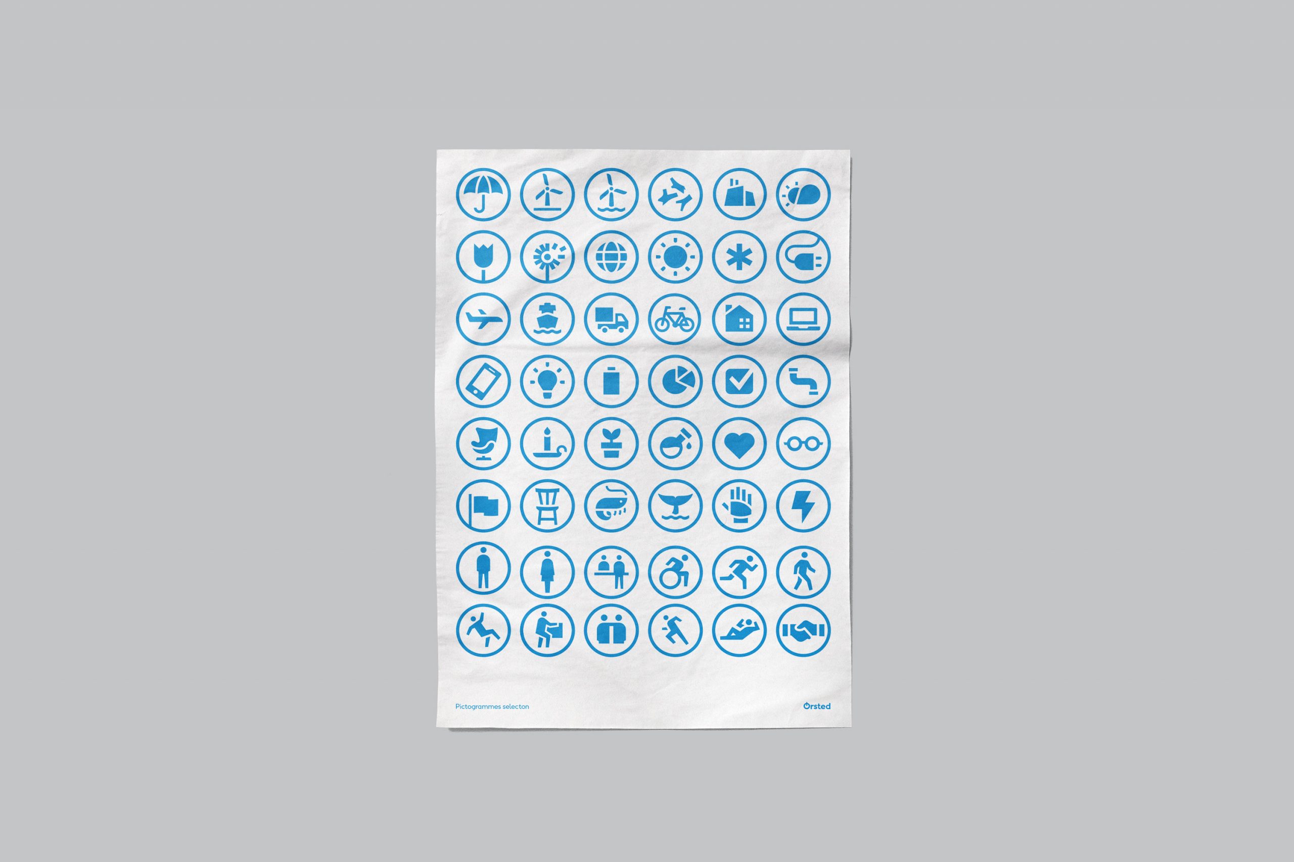
Ørsted pictogram system
CVI & icon design
Client
Developed inhouse at Ørsted
Role
Lead Graphic Designer.
In 2017 danish energy major Dong Energy changed their name and visual identity, in the biggest rebranding in danish history. For the core CVI , a pictogram system was needed, to exist in harmony with the custom font face – Ørsted Sans.
Ørsted wanted to take a bold yet optimistic stance for climate change and our common home, planet earth, while leaning heavily into their danish roots and heritage.
To reflect that, the pictogram system is rooted in the bold weight of Ørsted Sans – geometric, functionalist with a positive "wink in the eye".